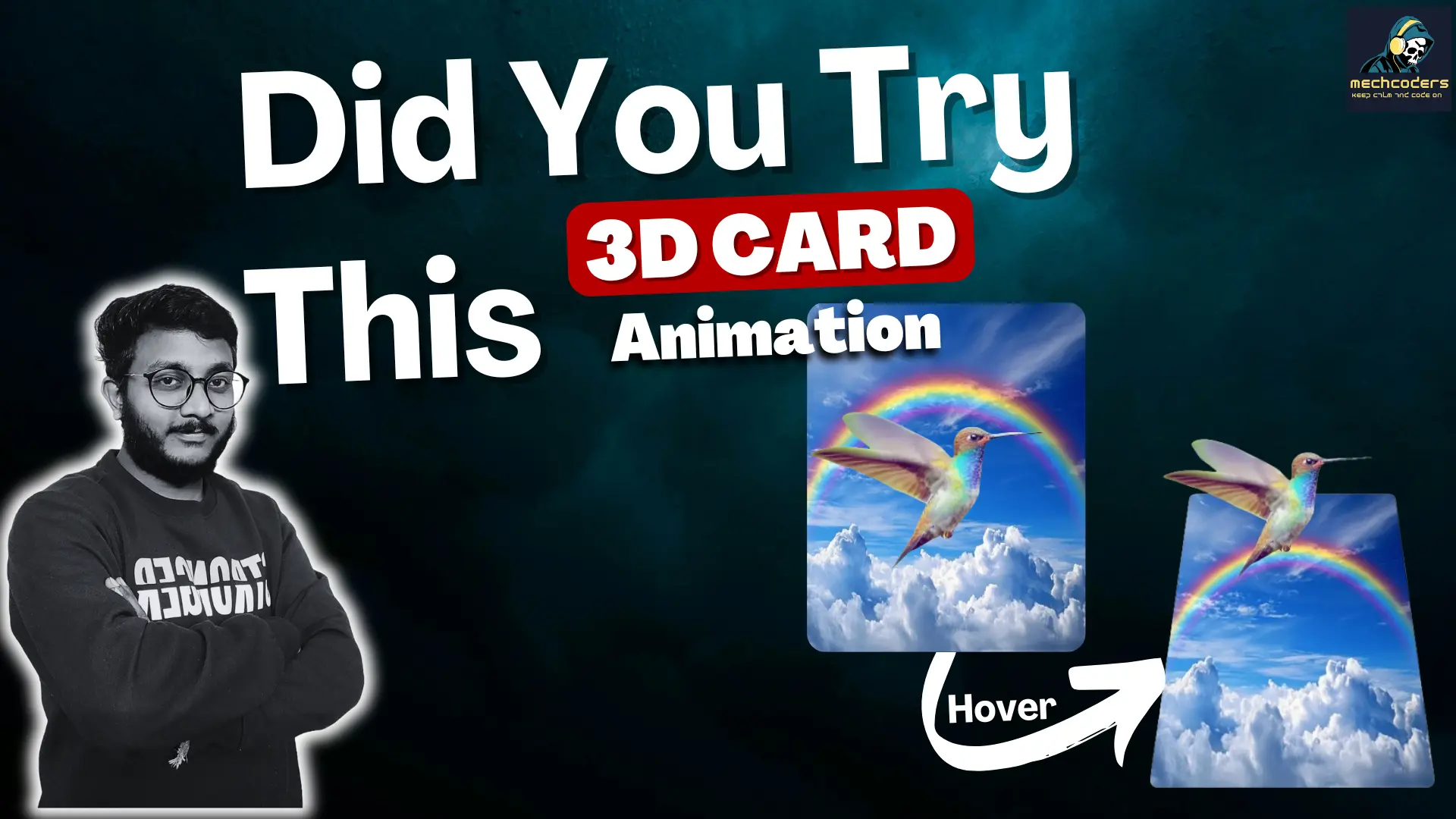
How to Create a 3D Card Hover Animation Effect with a Flying Bird Illusion Using Keyframes, HTML, and CSS

Learn how to create a stunning 3D card hover animation with a flying bird illusion using just HTML and CSS! This tutorial walks you through the process of designing an interactive card featuring dynamic background transitions and smooth animations. You’ll master CSS properties like transform, keyframes, and animation to craft a visually appealing design. Perfect for adding a professional touch to your web projects, this step-by-step guide also ensures responsiveness and easy customization.

Download the full code and assets to get started immediately and elevate your web development skills with this creative project! 🚀

Want to get Images?

Separate Code

HTML


    <title>3D Card Animationt</title>


    <div class="box">
        <div class="bg"></div>
        <div class="bird"></div>
    </div>


CSS

				
					/* basic reset */
*{
    margin: 0;
    padding: 0;
    box-sizing: border-box;
}

/* page setup */
body{
    display: flex;
    justify-content: center;
    align-items: center;
    min-height: 100vh;
    background: url(./Page\ Background.jpeg);
    background-position: center;
    background-repeat: no-repeat;
    background-size: cover;
}

/* container for animation */
.box{
    position: relative;
    width: 20rem;
    height: 25rem;
    cursor: pointer;
}

/* background setup */
.bg{
    width:100% ;
    height: 100%;
    position: absolute;
    background: url(./card\ Background.webp);
    background-position: center;
    background-size: cover;
    background-repeat: no-repeat;
    transition: transform 1s;
    border-radius: 10px;
    box-shadow: 0 10px 10px rgba(0, 0, 0, 0.2);
}

.box:hover .bg{
    transform: perspective(40px) rotateX(2deg) translateY(-50px);
}

/* bird animation */
.bird{
    position: absolute;
    width: 20rem;
    height: 20rem;
    background-image: url(./Bird\ Left\ Wing.png);
    background-repeat: no-repeat;
    background-size: 100%;
    animation: none;
    transition: transform 1s ;
}

.box:hover .bird{
    animation: birdanimation 0.3s steps(2) infinite;
    transform: translateY(-200px) translateX(-10px);
}

/* keyframes for bird flip */
@keyframes birdanimation{
    0%, 100%{
        background-image: url(./Bird\ Left\ Wing.png);
    }
    50% {
        background-image: url(./Bird\ Right\ Wing.png);
    }
}


Share :

Facebook
Twitter
LinkedIn
WhatsApp
Picture of Blog Authors

Blog Authors

Category

Recent Post

Share

Suscribe to Our Newsletter

No spam, notifications only about new products, updates.

Subscription Form

Suscribe for our Newsletter

Subscription Form

Related Post