Introduction:
When it comes to web design, creativity knows no bounds. The internet is filled with visually stunning websites that leave a lasting impression on visitors. One such creative technique is the implementation of smoke effects on web elements, adding an ethereal and mesmerizing touch to the design.
In this blog post, we’ll dive into the world of web design and explore how you can create a captivating smoke effect on text using HTML and CSS. We’ll break down the code step by step, explaining the purpose and functionality of each element, and provide instructions for implementing this effect in your own web projects.
The Smoke Effect Code
Let’s start by taking a look at the HTML and CSS code that powers this enchanting smoke effect:
<!DOCTYPE html>
<html lang="en">
<head>
    <meta charset="UTF-8">
    <meta http-equiv="X-UA-Compatible" content="IE=edge">
    <meta name="viewport" content="width=device-width, initial-scale=1.0">
    <title>Smoke Effect on Name</title>
    <style>
        /* CSS styles go here */
    </style>
</head>
<body>
    <section>
        <video src="/My Training/HTML/Smoke Effect/smoke.mp4" autoplay muted class="video"></video>
        <h1>
            <span>A</span>
            <span>B</span>
            <span>H</span>
            <span>I</span>
            <span>S</span>
            <span>H</span>
            <span>E</span>
            <span>K</span>
        </h1>
    </section>
</body>
</html>
HTML Structure and Setup
The HTML code starts with the basic structure of an HTML5 document. Here’s a breakdown of the essential components:
- Document Type Declaration (
<!DOCTYPE html>): This line specifies that the document adheres to HTML5 standards, ensuring compatibility with modern web browsers. - HTML Structure (
<html>, <head>, and <body>): The document is structured within the<html>tag, comprising two primary sections –<head>and<body>. The<head>section contains metadata and resources, while the<body>section holds the visible content of the webpage. - Meta Tags and Title: Inside the
<head>section, there are<meta>tags that define character encoding and viewport settings. Additionally, there’s a<title>tag that sets the webpage’s title, which appears in the browser’s title bar or tab.
Video Element
Within the <body> section, you’ll find a <video> the element responsible for displaying the video with the smoke effect:
<video src="/My Training/HTML/Smoke Effect/smoke.mp4" autoplay muted class="video"></video>srcAttribute: Thesrcattribute specifies the source location of the video file. In this code, it points to a video file located at “/My Training/HTML/Smoke Effect/smoke.mp4.” Make sure to replace this path with the correct path to your video file.autoplayAttribute: Theautoplayattribute ensures that the video plays automatically when the webpage loads.mutedAttribute: Themutedattribute mutes the video so that it doesn’t play audio. This is often used for background videos.class="video": Theclassattribute assigns the “video” class to the video element, which is used for styling in the CSS.
CSS Styling and Animation
The visual enchantment of the smoke effect is achieved through CSS styles and animations. The CSS code is embedded within a <style> block in the <head> section. Let’s explore the CSS code in detail:
<style>
    /* CSS styles go here */
</style>
Universal Reset (* Selector): The CSS code starts with a universal reset that sets margins, padding, and box-sizing for all HTML elements to normalize their styles across different browsers.
* {
    margin: 0;
    padding: 0;
    box-sizing: border-box;
}
Video Styling (.video Class): The .video class is applied to the video element and defines its appearance. It ensures the video takes up the full width of its container and is centered vertically. The object-fit: contain property scales the video to fit its container without stretching.
.video {
    object-fit: contain !important;
    top: 50%;
    width: 100%;
}- Background Color (
divSelector): The code styles a<div>element that serves as the background for the video. It sets the background color to black, creating a dark backdrop against which the smoke effect will be visible.
div {
    background-color: black;
}- Heading Styles (
h1Selector): The<h1>element contains the text to which the smoke effect will be applied. The CSS styles for the heading include text alignment, color, font size, letter spacing, and positioning.
h1 {
    position: absolute;
    top: 50%;
    transform: translateY(-50%);
    width: 100%;
    text-align: center;
    align-items: center;
    letter-spacing: 1rem;
    text-transform: uppercase;
    color: #f5f5f5;
    font-size: 09em;
    font-family: sans-serif;
}
Text Animation (@keyframes animate): The heart of the smoke effect lies in the keyframe animation defined as animate. This animation gradually changes the appearance of the text from opaque to fully visible while adding a rotating and blurring effect.
@keyframes animate {
    0% {
        opacity: 0%;
        transform: rotateY(90deg);
        filter: blur(10px);
    }
    100% {
        opacity: 1;
        transform: rotateY(0deg);
        filter: blur(0px);
    }
}- Animation Delay (
h1 span:nth-child(N)): To create a sequential animation for each letter in the heading, differentnth-childselectors with animation delays are used. Each letter of the text is wrapped in a<span>element, and thenth-child(N)selector assigns specific animation delays to each letter.
Here’s a breakdown of the animation delays:
span:nth-child(1)– Delay: 0.3sspan:nth-child(2)– Delay: 0.6sspan:nth-child(3)– Delay: 1.2sspan:nth-child(4)– Delay: 1.7sspan:nth-child(5)– Delay: 2.2sspan:nth-child(6)– Delay: 2.7sspan:nth-child(7)– Delay: 3.2sspan:nth-child(8)– Delay: 4s
Understanding the Smoke Effect
Now that we’ve dissected the code, let’s delve into the mechanics of the smoke effect and how it all comes together to create a mesmerizing visual experience.
Video Background
The foundation of this effect is the video background. It’s common in modern web design to use videos as background elements to add motion and depth to the webpage. In this case, the <video> element plays the role of the background, and its src attribute points to a video file.
<video src="/My Training/HTML/Smoke Effect/smoke.mp4" autoplay muted class="video"></video>The autoplay attribute ensures that the video begins playing automatically when the webpage loads, and the muted attribute silences the audio. Since the video is intended to be a visual backdrop, muting it is a common practice.
CSS Styling
The CSS styles applied to the video and other elements are crucial for achieving the desired look and feel of the smoke effect.
- The
.videoclass ensures that the video spans the entire width of its container while maintaining its aspect ratio. Theobject-fit: containproperty scales the video to fit the container without distorting it. - The
<div>element with a black background serves as the canvas against which the smoke effect will be visible. The dark background creates a stark contrast that enhances the visual impact of the smoke. - The
<h1>element contains the text that will undergo the smoke effect. It’s positioned at the center of the section both horizontally and vertically using CSS properties likeposition,top, andtransform. - The CSS styles for the text include setting the text color to a light grayish-white, increasing the letter spacing to add a sense of dispersion, and converting the text to uppercase for a uniform appearance.
Text Animation
The pièce de résistance of this smoke effect is the text animation defined using CSS keyframes. The @keyframes animate rule dictates how the text transitions from being invisible and blurry to fully visible with a slight rotation effect.
@keyframes animate {
    0% {
        opacity: 0%;
        transform: rotateY(90deg);
        filter: blur(10px);
    }
    100% {
        opacity: 1;
        transform: rotateY(0deg);
        filter: blur(0px);
    }
}- Opacity: The animation starts with an opacity of 0%, making the text completely transparent.
- Transform (Rotation): The
transformproperty applies a 3D rotation to the text. At the beginning (0%), the text is rotated 90 degrees along the Y-axis, effectively making it invisible from the front. As the animation progresses to 100%, the rotation returns to 0 degrees, making the text fully visible. - Filter (Blur): The
filterproperty adds a blur effect to the text. At the start of the animation (0%), the text is heavily blurred with a 10px blur radius, simulating the initial stages of smoke formation. As the animation reaches 100%, the blur is set to 0px, bringing the text into sharp focus.
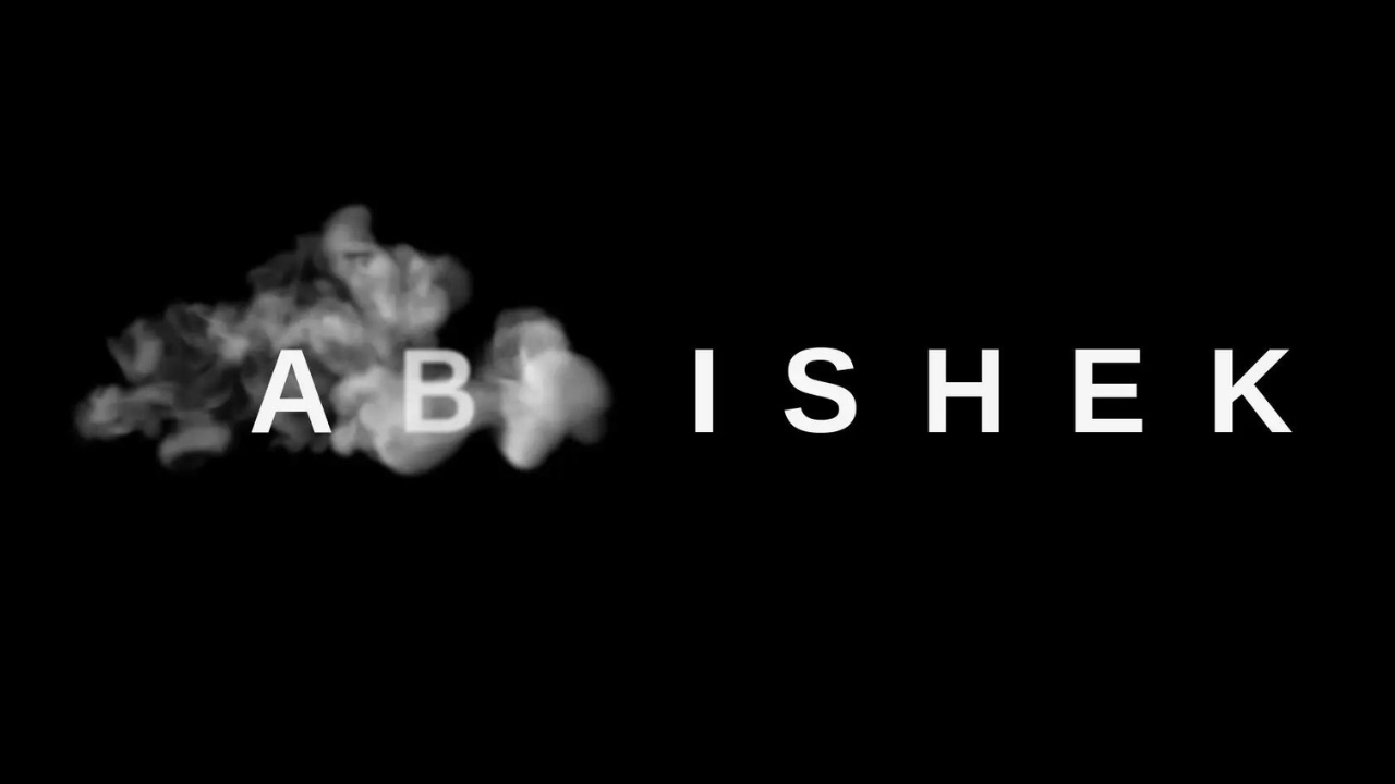
Sequential Animation
To create a realistic smoke effect, it’s essential that the animation appears to affect individual letters of the text independently. This is achieved using nth-child selectors in CSS. Each letter of the text is wrapped in a <span> element, allowing for precise targeting of individual characters.
<h1>
    <span>A</span>
    <span>B</span>
    <span>H</span>
    <span>I</span>
    <span>S</span>
    <span>H</span>
    <span>E</span>
    <span>K</span>
</h1>
The animation delay for each <span> element is carefully adjusted to create a staggered effect. This means that each letter will begin its smoke-like transformation at a slightly different time, mimicking the organic nature of smoke formation.
span:nth-child(1) {
    animation-delay: 0.3s;
}
span:nth-child(2) {
    animation-delay: 0.6s;
}
span:nth-child(3) {
    animation-delay: 1.2s;
}
span:nth-child(4) {
    animation-delay: 1.7s;
}
span:nth-child(5) {
    animation-delay: 2.2s;
}
span:nth-child(6) {
    animation-delay: 2.7s;
}
span:nth-child(7) {
    animation-delay: 3.2s;
}
span:nth-child(8) {
    animation-delay: 4s;
}
The result is a mesmerizing smoke effect that gives the impression of letters materializing from smoke, one after the other.
Implementing the Smoke Effect
Now that we’ve dissected the code and understood how the smoke effect works, you might be eager to implement it in your own web projects. Here’s a step-by-step guide on how to do just that:
1. Prepare Your Video
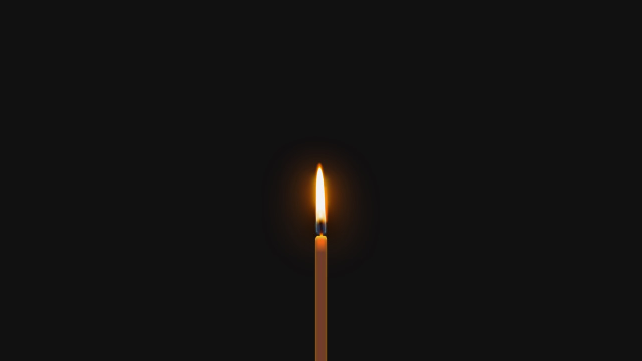
First, you’ll need a video file that you want to use as the background for your smoke effect. Make sure the video is relevant to your content and has a visually appealing and smooth motion. Ensure that you have the rights or permissions to use the video.
Video Link – Download
2. Organize Your Project
Create a new directory or folder for your project. Inside this folder, create two subfolders: one for your HTML and CSS files and another for your video assets. Place your video file in the video assets folder.
Your project structure might look like this:
project-folder/
│
├── index.html
├── styles.css
│
└── video-assets/
    └── your-video.mp4
3. Copy the HTML and CSS Code
Copy the HTML code provided earlier and paste it into your index.html file. Ensure that you update the src attribute of the <video> element to point to the correct path of your video file.
Next, copy the CSS code and paste it into your styles.css file. You can further customize the styles to match your project’s branding and design.
4. Customize the Text
Inside the <h1> element, replace the text with your desired message or title. You can also adjust the styling of the text, such as the font size, color, or letter spacing, to align with your project’s aesthetics.
5. Test Your Project
Open the index.html file in a web browser to test your smoke effect. You should see the video playing in the background, and the text should undergo the mesmerizing smoke transformation.
6. Fine-Tune and Experiment
Feel free to experiment with the animation properties in the CSS code. You can modify the animation duration, delay, or the intensity of the blur effect to achieve your desired visual effect. Don’t hesitate to get creative and make it your own.
Conclusion
Creating a smoke effect on text using HTML and CSS is a captivating way to enhance the visual appeal of your web projects. By combining video backgrounds, carefully crafted CSS animations, and sequential effects on individual letters, you can achieve an enchanting and mesmerizing result that leaves a lasting impression on your website visitors.
As you explore and experiment with this technique, you’ll discover endless possibilities for incorporating smoke effects into various elements of your web designs. Whether you’re building a portfolio, a landing page, or an interactive web experience, the smoke effect adds a touch of magic that sets your project apart.
So, go ahead, dive into the world of web design creativity, and let your imagination flow like smoke.
We hope you find this article helpful. Feel free to explore our other posts on Mechcoders Blogs.
If you liked this article, then please subscribe to our YouTube Channel for WordPress video tutorials. You can also find us on Linkedin and Facebook.