FlameCraft: Dominate Candle Flame Animation

FlameCraft: Dominate Candle Flame Animation

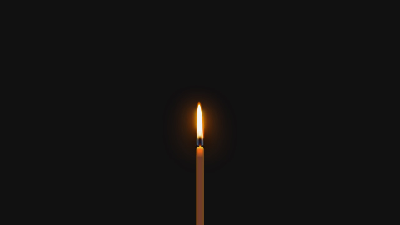
Do you want to add a touch of warmth and ambiance to your website? Imagine captivating your visitors with a mesmerizing candle flame animation that dances gracefully across the screen. With just a sprinkle of HTML and CSS magic, you can bring this enchanting effect to life.

In this comprehensive tutorial, we’ll explore in detail how to create a stunning candle flame animation using HTML and CSS. Whether you’re a seasoned front-end developer looking to enhance your skills or a beginner eager to embark on your web design journey, this tutorial will equip you with the knowledge and inspiration to add a flicker of creativity to your projects.

FlameCraft Mastering Candle Flame Animation

Setting the Scene with HTML

Let’s start by setting up the structure of our candle flame animation. HTML provides us with the building blocks to define the elements involved in creating the visual effect. Our goal is to create a realistic representation of a candle flame, complete with a flickering flame, a wick, and melting wax.

<!DOCTYPE html>
<html lang="en">
<head>
  <meta charset="UTF-8">
  <meta name="viewport" content="width=device-width, initial-scale=1.0">
  <style>
    /* CSS styles will be added here */
  </style>
</head>
<body>
  <div class="candle">
    <div class="flame">
      <!-- Flame elements will be nested here -->
    </div>
    <div class="wick"></div>
    <div class="wax"></div>
  </div>
</body>
</html>

Bringing the Candle Flame Animation to Life with CSS

Now, let’s sprinkle some CSS magic to animate our candle flame. CSS is where the real transformation happens. By leveraging CSS animations and transformations, we’ll breathe life into our static HTML structure, creating a lifelike flickering effect that adds a touch of realism to our design.

/* CSS styles for candle flame animation */
.candle {
  width: 100px; /* Adjust width as needed */
  height: 200px; /* Adjust height as needed */
  position: relative;
}

.flame {
  position: absolute;
  top: 20%; /* Adjust vertical position as needed */
  left: 50%;
  transform: translateX(-50%);
}

.wick {
  position: absolute;
  width: 6px; /* Adjust width as needed */
  height: 50px; /* Adjust height as needed */
  background: #23161a; /* Adjust color as needed */
  top: calc(100% - 10px); /* Adjust vertical position as needed */
  left: 50%;
  transform: translateX(-50%);
}

.wax {
  position: absolute;
  width: 80px; /* Adjust width as needed */
  height: 80px; /* Adjust height as needed */
  background: #ff9224; /* Adjust color as needed */
  border-radius: 50%;
  bottom: 0;
  left: 50%;
  transform: translateX(-50%);
}

/* Add animation keyframes for the flame */
@keyframes flicker {
  0% {
    opacity: 0.9;
  }
  50% {
    opacity: 1;
  }
  100% {
    opacity: 0.9;
  }
}

.flame:before {
  content: "";
  position: absolute;
  width: 60px; /* Adjust width as needed */
  height: 80px; /* Adjust height as needed */
  background: radial-gradient(ellipse at bottom, #ff6a00 20%, transparent 100%); /* Adjust colors as needed */
  top: -60px; /* Adjust vertical position as needed */
  left: 50%;
  transform: translateX(-50%);
  border-radius: 50%;
  animation: flicker 1s infinite alternate;
}

Understanding the Anatomy of a Flame

Before we delve into the intricacies of CSS animations, let’s take a moment to understand the anatomy of a flame. A typical candle flame consists of several distinct parts, each contributing to its mesmerizing dance:

  1. Wick: The wick serves as the fuel delivery system for the flame, drawing liquid wax upward through capillary action.
  2. Flame: The visible portion of the flame is where combustion occurs, releasing heat and light as it consumes fuel.
  3. Shadows: The interplay of light and shadow adds depth to the flame, creating an illusion of movement and dimensionality.
  4. Bottom: The base of the flame provides stability and anchors it to the wick, ensuring it remains upright and flickers gracefully.

Understanding these components will help us create a more realistic and visually appealing candle flame animation.

Embracing Creativity and Customization

One of the most exciting aspects of creating candle flame animations is the opportunity for creativity and customization. With CSS, the possibilities are virtually endless. You can experiment with different colors, shapes, and timing functions to achieve the desired visual effect. Whether you prefer a traditional golden flame or a whimsical rainbow-colored flicker, let your imagination soar!

Exploring Advanced Techniques

Once you’ve mastered the basics of candle flame animation, why not explore some advanced techniques to take your design to the next level? Here are a few ideas to spark your creativity:

  • Interactive Flames: Use JavaScript to create interactive flames that respond to user interactions, such as mouse movements or clicks.
  • Particle Effects: Experiment with CSS particle effects to simulate sparks or embers flying off the flame, adding an extra layer of realism to your animation.
  • Dynamic Lighting: Combine CSS animations with SVG filters to simulate dynamic lighting effects, such as flickering shadows or reflections on nearby objects.

Conclusion

With just a dash of HTML and CSS wizardry, you can transform your website into a captivating visual masterpiece. The candle flame animation we’ve created adds a touch of warmth and charm, inviting visitors to linger and explore. Whether you’re designing a cozy home page or a festive holiday-themed landing page, a flickering candle flame is sure to captivate your audience and leave a lasting impression.

So why wait? Let your creativity shine and illuminate your web with captivating candle flame animations that mesmerize your audience. Happy coding!

Separate Code

HTML

Instruction of Use

  1. Document Type Declaration (DOCTYPE):
    • The <!DOCTYPE html> declaration defines the document type and version of HTML being used, which is HTML5 in this case. It ensures that the browser renders the document in standards mode.
  2. HTML Structure:
    • The code begins with <html> and includes the <head> and <body> sections.
    • The <head> section contains metadata and links to external resources, while the <body> section contains the visible content of the webpage.
  3. Meta Tags:
    • The <meta> tags within the <head> section specify character encoding (charset) and viewport settings (viewport) for the webpage. These meta tags ensure proper rendering and responsiveness across different devices.
  4. Title:
    • The <title> element sets the title of the webpage, which appears in the browser’s title bar or tab. It helps users identify the webpage and improves SEO.
  5. Video Element:
    • There is no video element in the provided code. However, if you intend to include a video with a smoke effect, you can use the <video> element.
    • The src attribute of the <video> element should point to the video file’s location on your server.
  6. CSS Styles:
    • The CSS styles for elements within the HTML document are embedded within a <style> block in the <head> section.
    • These styles define the appearance and animations of various elements on the page, including the candle flame animation.
  7. Heading Element:
    • The <h1> element contains the text “ABHISHEK” with individual letters wrapped in <span> elements.
    • These <span> elements are used for applying animations to each letter, allowing for customized animations or effects.


  <div class="candle">
    <div class="flame">
      <div class="shadows"></div>
      <div class="top"></div>
      <div class="middle"></div>
      <div class="bottom"></div>
    </div>
    <div class="wick"></div>
    <div class="wax"></div>
  </div>


CSS

Instruction of Use

    1. Body Styling:
      • The body selector sets basic styles for the entire webpage, such as the background color (background) and font color (color).
      • Adjust these properties to customize the overall appearance of your webpage.
    2. Candle Styling:
      • The .candle class styles the container for the candle animation. Adjust the width, height, and position properties as needed to position and size the candle appropriately on your webpage.
    3. Flame Animation:
      • The .flame class styles the flame element of the candle.
      • Adjust the position, top, and left properties to position the flame within the candle container.
      • The transform property with translateX(-50%) centers the flame horizontally within its container.
      • The animation property applies the move animation to the flame, giving it a flickering effect.
    4. Wick Styling:
      • The .wick class styles the wick element of the candle.
      • Adjust the position, width, height, background, and top properties to customize the appearance and position of the wick.
    5. Wax Styling:
      • The .wax class styles the wax element of the candle.
      • Adjust the position, width, height, background, border-radius, bottom, and left properties to customize the appearance and position of the wax.
    6. Animation Keyframes:
      • The @keyframes rule defines the move animation for the flame.
      • Adjust the keyframe percentages and properties (transform, opacity, etc.) to customize the flickering effect of the flame.
				
					    body {
  background: #111;
  display: flex;
  margin: 0;
  position: absolute;
  width: 100%;
  height: 100%;
  overflow: hidden;
}

.candle {
  width: 34px;
  margin: 30px auto 0 auto;
  position: relative;
  height: 50%;
  align-self: flex-end;
  animation: blink 0.1s infinite;
}

.wick {
  position: absolute;
  width: 6px;
  height: 50px;
  background: #23161a;
  top: calc(150px - 0.8 * 50px);
  left: 50%;
  transform: translateX(-50%) skewX(2deg);
  border-radius: 10%;
  box-shadow: 0 0 2px 0px black;
}

.wick:before {
  content: "";
  position: absolute;
  width: 0;
  left: 50%;
  height: 10px;
  box-shadow: 0 -14px 10px 8px white, 0 -10px 10px 8px rgba(255, 215, 0, 0.7),
    0 -3px 10px 8px rgba(255, 106, 0, 0.7),
    0 6px 3px 4px black;
}

.wick:after {
  content: "";
  position: absolute;
  left: 50%;
  bottom: 0;
  width: 0px;
  height: 0px;
  box-shadow: 0 5px 2px 3px gold, 0 20px 2px 14px gold,
    0 -6px 4px 5px rgba(98, 33, 27, 0.8),
    0 0px 1px 4px rgba(255, 106, 0, 0.7),
    0 0px 3px 4px #ff6a00,
    0 5px 3px 4px gold;
}

.flame {
  width: 20px;
  height: 150px;
  margin: 0px auto;
  position: relative;
  animation: move 3s infinite, move-left 3s infinite;
  transform-origin: 50% 90%;
}

.flame .top {
  width: 20px;
  height: 100%;
  position: absolute;
  top: 0;
  left: 0;
  background: white;
  border-top-left-radius: 500%;
  border-bottom-left-radius: 50px;
  border-top-right-radius: 500%;
  border-bottom-right-radius: 50px;
  transform: skewY(-10deg);
  box-shadow: 0 0px 0px 3px white, 0 -20px 1px 4px white, 0 -25px 2px 3px gold,
    0 -30px 5px 4px #ff6a00,
    0 0px 150px 10px #ff6a00,
    0 -10px 2px 4px white,
    0 -5px 3px 3px white;
  animation: flame-up 4s infinite;
}

.flame .shadows {
  position: absolute;
  left: 50%;
  top: 0;
  width: 1px;
  height: 60px;
  border-radius: 50%;
  box-shadow: 0 5px 20px 15px gold, 0 0px 100px 20px #ff6a00,
    0 15px 50px 15px #ff6a00, 5px 30px 5px 13px #ff6a00,
    5px 50px 5px 13px #ff6a00, 0 75px 50px 30px black;
}

.flame .bottom {
  transform: scale(0.9);
  position: absolute;
  bottom: 6px;
  left: 9px;
  width: 1px;
  height: 8px;
  border-radius: 1%;
  background: #2c2b39;
  box-shadow: 0 6px 10px 12px rgba(60, 76, 125, 0.3),
    0 0px 4px 8px #2c2b39,
    0 -12px 10px 8px rgba(255, 106, 0, 0.5),
    0 5px 7px 12px #2c2b39,
    0 -3px 10px 12px #2c2b39, 5px -10px 10px 5px red, 0 -15px 10px 10px gold,
    5px -25px 10px 5px gold, 0 2px 5px 10px #30537d,
    0 -2px 2px 14px #76daff, 0 2px 10px 12px #76daff;
}

.wax {
  position: relative;
  top: 15px;
  width: 100%;
  height: 100%;
  background: #ff9224;
  background: -moz-linear-gradient(
    top,
    #ff9224 0px,
    #ff9224 20px,
    #58523a 50px
  );
  background: -webkit-linear-gradient(
    top,
    #ff9224 0px,
    #ff9224 20px,
    #58523a 50px
  );
  background: linear-gradient(
    to bottom,
    #ff9224 0px,
    #ff9224 20px,
    #58523a 50px
  );
  filter: progid:DXImageTransform.Microsoft.gradient(
    startColorstr="#ff9224",
    endColorstr="#58523a",
    GradientType=0
  );

  border-top-left-radius: 10px;
  border-top-right-radius: 10px;
  box-shadow: inset 0 7px 12px -2px #fbf348,
    inset 0 9px 57px -3px rgba(255, 0, 0, 0.4),
    inset 0 -5px 8px 2px black,
     0 0 3px 0px #ff6a00;
}

@keyframes move {
  0% {
    transform: skewX(2deg) skewY(5deg);
  }
  50% {
    transform: skewX(-2deg) skewY(-0deg);
  }
  100% {
    transform: skewX(2deg) skewY(5deg);
  }
}

@keyframes move-left {
  50% {
    transform: skewX(3deg);
  }
}

@keyframes flame-up {
  50% {
    box-shadow: 0 0px 0px 3px white, 0 -38px 1px 2px white, 0 -41px 2px 3px gold,
      0 -50px 5px 4px #ff6a00,
      0 0px 150px 10px #ff6a00,
      0 -10px 2px 4px white,
      0 -5px 3px 3px white;
  }
}

@keyframes blink {
  50% {
    opacity: 0.95;
  }
}


Share :

Facebook
Twitter
LinkedIn
WhatsApp
Picture of Abhishek Yadav

Abhishek Yadav

Table of Contents

Category

Recent Post

Share

Suscribe to Our Newsletter

No spam, notifications only about new products, updates.

Subscription Form

Suscribe for our Newsletter

Subscription Form

Related Post